Bivariate Continuous data (Part 3 of 4)

Chapter 14.

Exploring bivariate Continuous x Continuous data

This chapter explores how to summarize and visualize the interaction between bivariate continuous data using correlation analysis, scatter plots, scatter plot matrices and other such techniques. [1]

Data: Suppose we run the following code to prepare the mtcars data for subsequent analysis and save it in a tibble called tb.

# Load the required libraries, suppressing annoying startup messages
library(dplyr, quietly = TRUE, warn.conflicts = FALSE)
library(tibble, quietly = TRUE, warn.conflicts = FALSE)
library(knitr, quietly = TRUE, warn.conflicts = FALSE) 
library(ggplot2, quietly = TRUE, warn.conflicts = FALSE)
library(car, quietly = TRUE, warn.conflicts = FALSE) 
library(psych, quietly = TRUE, warn.conflicts = FALSE) 
library(GGally, quietly = TRUE, warn.conflicts = FALSE)
Registered S3 method overwritten by 'GGally':
  method from   
  +.gg   ggplot2
# Read the mtcars dataset into a tibble called tb
data(mtcars)
tb <- as_tibble(mtcars)

# Convert relevant columns into factor variables
tb$cyl <- as.factor(tb$cyl) # cyl = {4,6,8}, number of cylinders
tb$am <- as.factor(tb$am) # am = {0,1}, 0:automatic, 1: manual transmission
tb$vs <- as.factor(tb$vs) # vs = {0,1}, v-shaped engine, 0:no, 1:yes
tb$gear <- as.factor(tb$gear) # gear = {3,4,5}, number of gears

# Directly access the data columns of tb, without tb$mpg
attach(tb)
The following object is masked from package:ggplot2:

    mpg

Scatterplots

  1. A scatter plot is used to display the relationship between two continuous variables. It is a graphical representation of a bivariate distribution, where the values of two variables are plotted as points on a two-dimensional coordinate system.

  2. A scatter plot can be used to identify trends, clusters, and other patterns in the data. It is also useful for detecting the presence of any outliers or influential observations that may affect the analysis. [1]

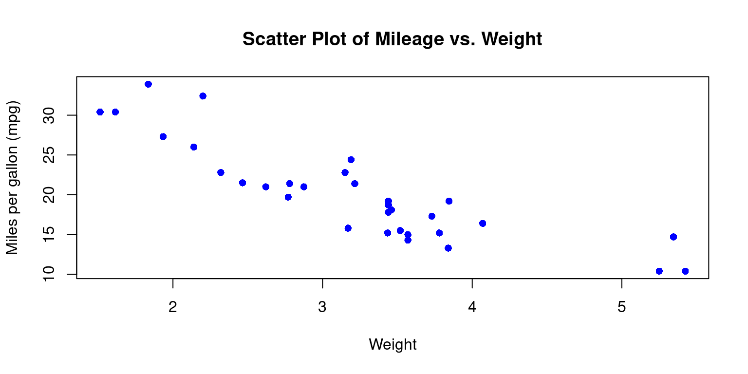
  3. To create a scatter plot of mpg (miles per gallon) against wt (weight) in the mtcars data set, we can use the following code:

Scatterplot using plot()

# Create a scatter plot of Miles per Gallon (mpg) vs. Weight
plot(wt, 
     mpg, 
     main = "Scatter Plot of Mileage vs. Weight", # Set the title 
     xlab = "Weight",                # Label for the x-axis
     ylab = "Miles per gallon (mpg)",# Label for the y-axis
     pch = 16,                       # Use filled circles as data points
     col = "blue"                    # Set the color of the points to blue
     )

  1. Discussion:
  • This code will create a scatter plot of mpg against wt using the plot() function.

  • The main argument adds a title to the plot, the xlab and ylab arguments add axis labels

  • The pch argument sets the shape of the points to a solid circle. pch = 15 gives a filled square. Recall other popular values: pch = 16 gives a filled circle, pch = 17 gives a filled triangle (pointing upwards), pch = 18 gives a filled diamond, pch = 19 gives a solid circle, pch = 20 gives a filled bullet (smaller than pch = 19)

  • the col argument specifies the color of the data points. Recall we can use any named color in R, or we can use hexadecimal color codes. For instance, col = "#FF0000" would give us red points. [1]

  1. Personalizing Scatter Plots
  • We can personalize the appearance of the scatterplot in a variety of additional ways.
# Create a scatter plot of Mileage (mpg) vs. Weight
plot(wt, 
     mpg, 
     main = "Scatter Plot of MPG vs. Weight",  # Set the plot title
     xlab = "Weight",        # Label for the x-axis
     ylab = "Mileage (mpg)", # Label for the y-axis
     pch = 16,               # Use filled circles as data points
     cex = 1.5,              # Increase the size of data points
     col = "blue",           # Set the color of data points to blue
     col.lab = "red",        # Set the color of axis labels to red
     cex.lab = 1.5,          # Increase the size of axis labels
     col.main = "darkgreen", # Set the color of the plot title to dark green
     cex.main = 2,           # Increase the size of the plot title
     bg = "gray"             # Set the background color to gray
     )
# Add a grid with black dashed lines of width 0.8
grid(col = "black", 
     lty = "dashed", 
     lwd = 0.8)

  1. Discussion
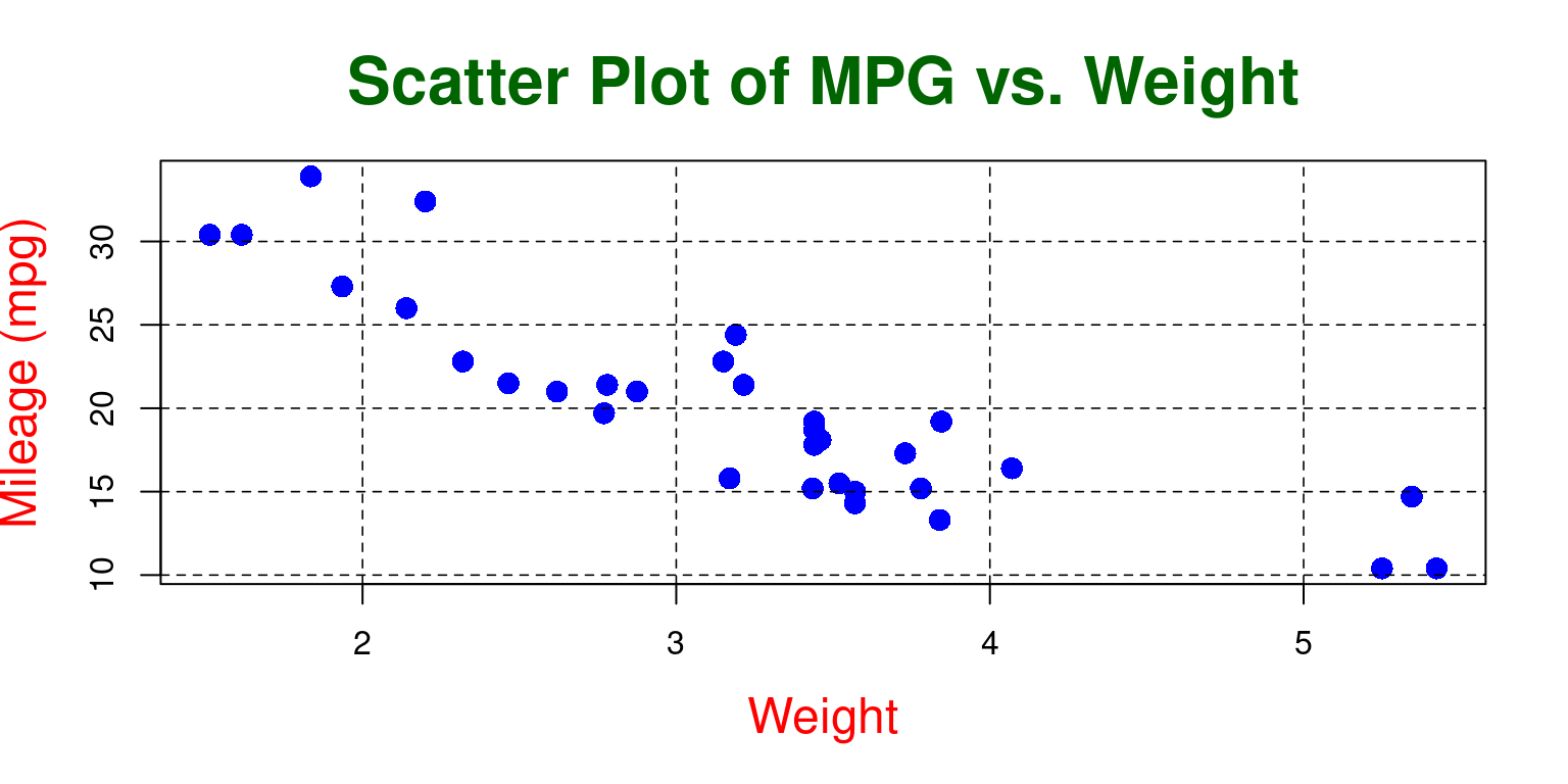
  • Point Size: In the second plot, the size of the points is 1.5 times the default size (cex = 1.5), while in the first plot, the size of the points is the default size as cex is not specified.

  • Axis Labels’ Color and Size: The second plot has red-colored, larger size axis labels (col.lab="red", cex.lab=1.5), while the first plot uses the default color and size as these parameters are not specified.

  • Title’s Color and Size: The second plot has a dark green title that is twice the default size (col.main="darkgreen", cex.main=2), while the first plot uses the default color and size for the title as these parameters are not specified.

  • Background Color: The second plot has a light gray background (bg = "lightgray"), while the first plot uses the default background color as the bg parameter is not specified.

  • Grid: The second plot includes a grid with gray dotted lines (grid(col = "gray", lty = "dotted", lwd = 0.5)), while the first plot does not have a grid as the grid() function is not called. [2]

  1. Scatterplot with best fit line
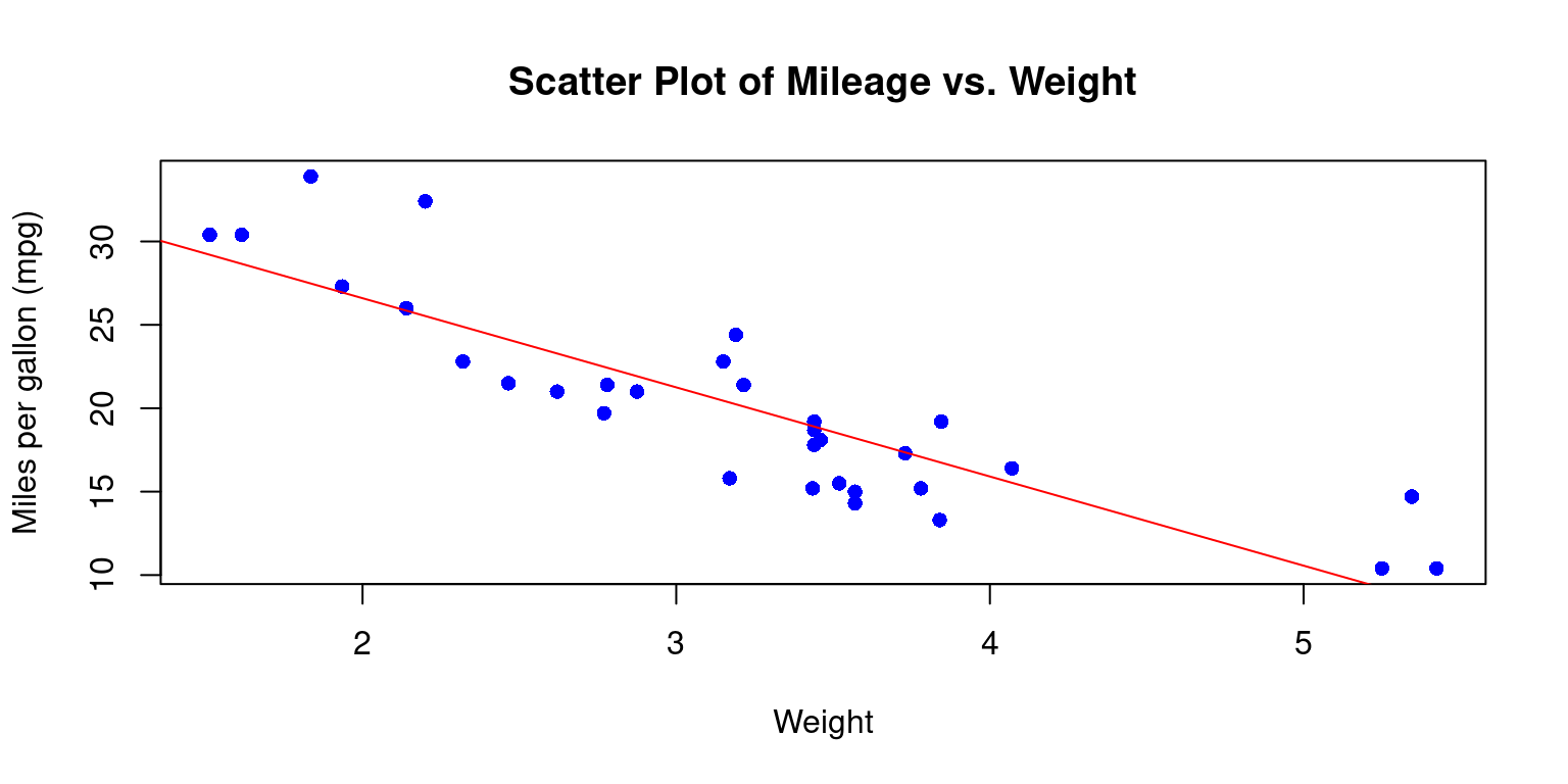
  • We can add a line of best fit (a regression line) to your scatterplot using the abline() and lm() functions. lm() is used to fit linear models, and abline() adds a straight line to the plot. [3]
# Create a scatter plot of Miles per gallon (mpg) vs. Weight 
# with blue data points
plot(tb$wt, 
     tb$mpg, 
     main = "Scatter Plot of Mileage vs. Weight",  # Set the plot title
     xlab = "Weight",                  # Label for the x-axis
     ylab = "Miles per gallon (mpg)",  # Label for the y-axis
     pch = 16,                         # Use filled circles as data points
     col = "blue"                      # Set the color of data points to blue
     )

# Fit a linear model to the data
fit <- lm(tb$mpg ~ tb$wt)

# Add a red regression line to the plot
abline(fit, col = "red")

  1. Discussion:
  • lm(tb$mpg ~ tb$wt) fits a linear model predicting mpg from wt. The ~ operator is a formula operator in R that separates the response variable (on the left of ~) from the predictor variables (on the right of ~). abline(fit, col = "red") subsequently adds the regression line to the plot, drawn in red color. [3]
  1. Visualizing Continuous x Continuous x Categorical data
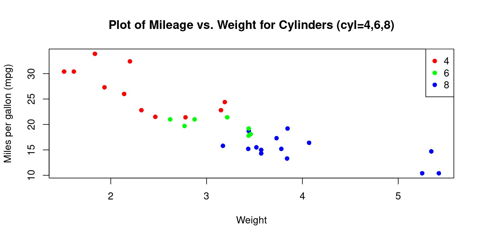
  • Consider the issue of visualizing two continuous variables wt (Weight and mpg (Miles per gallon) for different levels of a categorical variable cyl (Cylinders).
# Create a scatter plot of Miles per gallon (mpg) vs. Weight, 
# where points are colored by the number of cylinders (cyl)
plot(tb$wt, 
     tb$mpg, 
     main = "Plot of Mileage vs. Weight for Cylinders (cyl=4,6,8)",
     xlab = "Weight", 
     ylab = "Miles per gallon (mpg)", 
     pch = 16,  # Use filled circles as data points
     col = c("red", "green", "blue")[tb$cyl]  # Color points on cyl
     )

# Add a legend to the top-right corner of the plot
legend("topright", 
       legend = levels(tb$cyl),  # Display legend labels for each cylinder
       col = c("red", "green", "blue"),  # Define colors for the legend
       pch = 16)  # Use filled circles as legend symbols

  1. Discussion
  • In the snippet col=c("red","green","blue")[tb$cyl], we assign the color of the data points according to the cyl variable. It translates to distinct colors for different cyl values in the plot.

  • Moreover, when we incorporate the legend() function with parameters such as "topright", we place a legend at the top-right corner of the plot. The identifiers and color scheme in the legend correspond to the unique values of the cyl variable. [2]

Scatterplot Matrix

  1. A scatter plot matrix, also known as a pairs plot or SPLOM, is a powerful visual tool that helps us in depicting the pair-wise relationships among a group of variables. In this matrix, every distinct variable from the dataset is charted against each other in a grid-like structure. This enables us to delve into the associations between variable pairs and identify possible trends or patterns in the dataset.

  2. When dealing with multivariate datasets, scatter plot matrices can be remarkably handy. They equip us with a rapid way to discern potential correlations among variable pairs – whether they are strong, weak, or non-existent. It’s also a convenient method to spot non-linear relationships between variables. In addition, it’s a beneficial tool to recognize outliers or peculiar data points and to observe clusters or collections of observations. [2], [3]

Scatterplot Matrix using pairs()

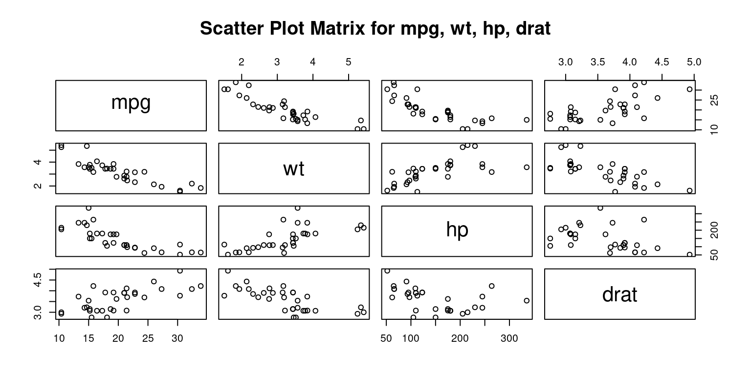
  1. The following R code creates a scatter plot matrix, also known as a pairs plot, for four variables: mpg (miles per gallon), wt (weight), hp (horsepower), and drat (rear axle ratio). This is performed on the data stored in the tb data frame.
# Define the columns we want to include in the scatter plot matrix
columns <- c("mpg", "wt", "hp", "drat")

# Create a scatter plot matrix using the selected columns from the data frame
pairs(tb[, columns], 
      main = "Scatter Plot Matrix for mpg, wt, hp, drat" # Set the title
)

  1. Discussion:
  • The pairs() function in R is designed to take a subset of the tb data frame consisting of the columns specified in the columns vector and construct a matrix of scatter plots.

  • The plots are arranged in a grid format, where the variable for each row is plotted against the variable for each column. [2], [3]

  1. Personalizing Scatterplot Matrix using pairs()
# Create a scatter plot matrix for the columns "mpg," "wt," "hp," and "drat"
pairs(tb[, c("mpg", "wt", "hp", "drat")],  # Subset the data
      main = "Scatter Plot Matrix for mpg, wt, hp, drat",  # title 
      pch = 19,  # Set the point character (solid circles)
      labels = c("Miles per Gallon", "Weight", "Horsepower", "Rear Axle Ratio"), 
      col = "blue",  # Set point color to blue
      cex = 0.8  # Set the size of the points
      )

  1. Discussion:
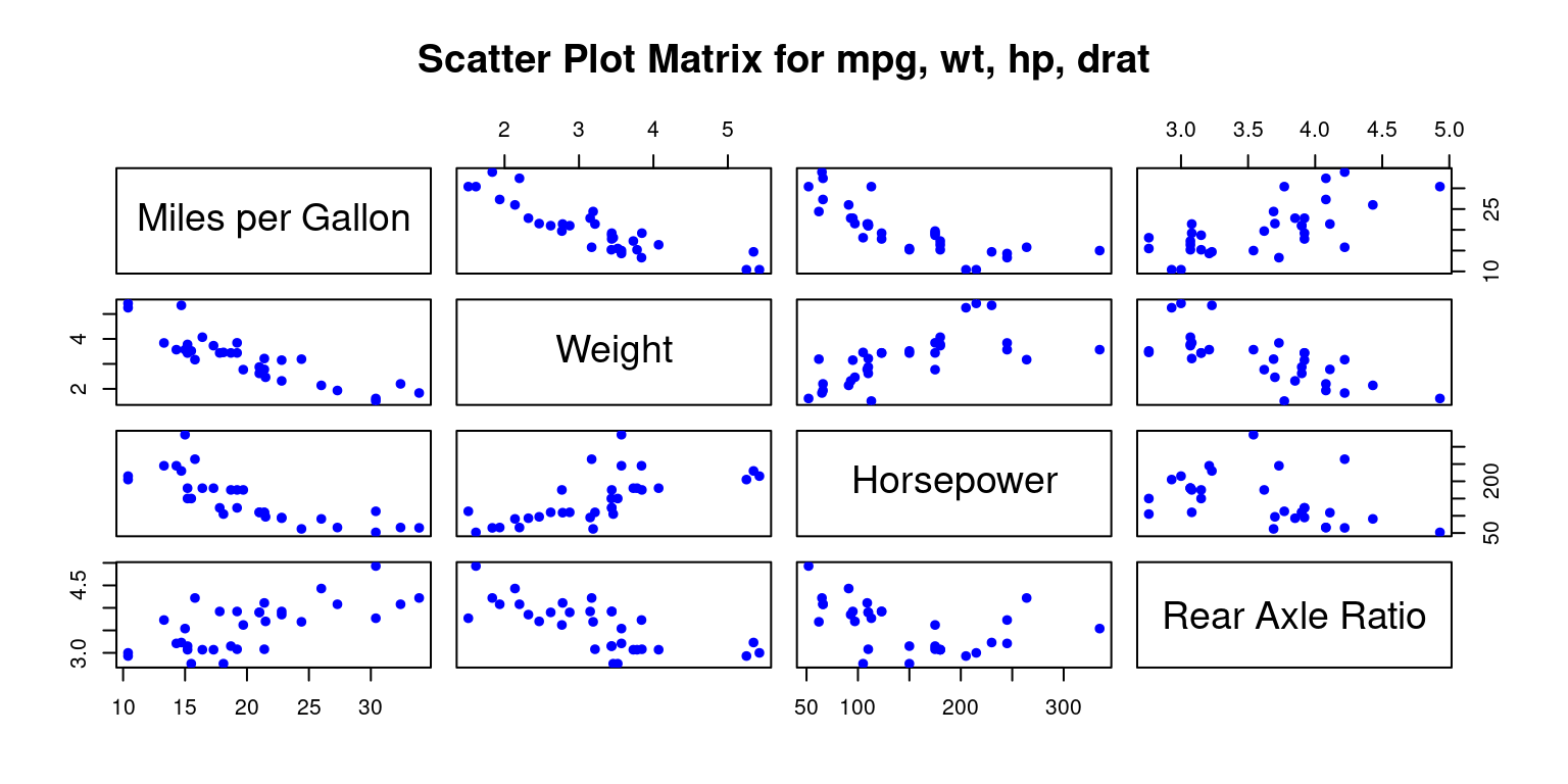
  • Symbol: The pch parameter is used to specify the symbol that represents data points in a plot.

  • Labels: The labels parameter lets us customize the variable labels that appear on the diagonal:

  • Color: We can specify different colors for the points in each scatter plot with the col parameter.

  • Point Size: The cex parameter controls the size of the points in the scatter plot. [2], [3]

Scatter Plot Matrix using scatterplotMatrix() from package car

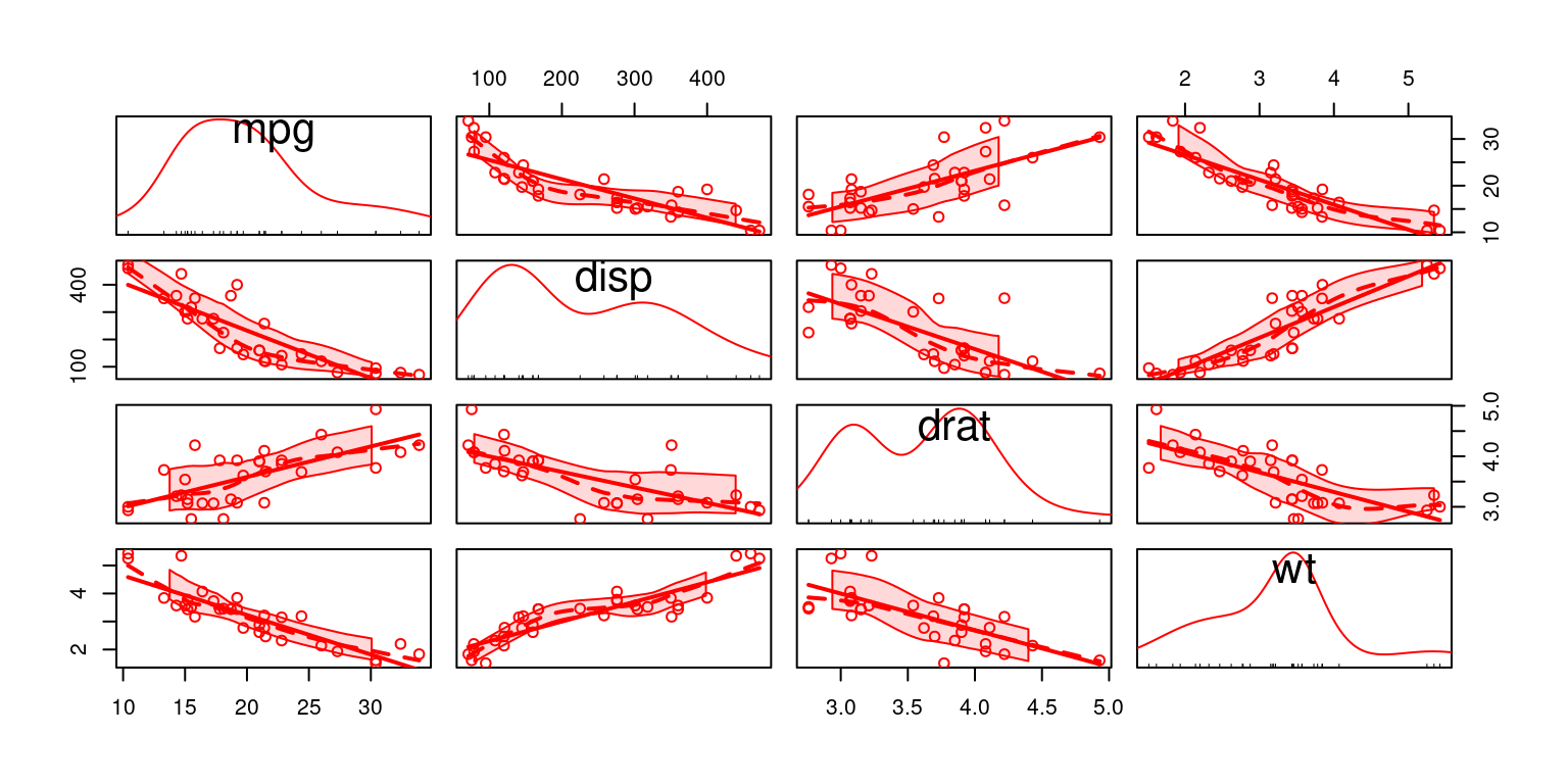
  1. The following code creates an alternate scatterplot matrix for each pair of the variables mpg, disp, drat, and wt, allowing us to explore the relationships among these four variables. [6]
# Load the car package
library(car)

# Create a scatterplot matrix using scatterplotMatrix()
scatterplotMatrix(data = tb,
                  ~ mpg + disp + drat + wt,  # variables 
                  col = c("red"))  # Set the point color to red

  1. Discussion:
  • The car package, short for Companion to Applied Regression, contains numerous functions and datasets that are helpful for regression analysis.

  • For creating a scatterplot matrix,, we use the scatterplotMatrix() function.

  • Here, the data argument specifies the data frame we are working with, tb.

  • The formula ~ mpg + disp + drat + wt indicates the variables to be included in the scatter plot matrix. Recall mpg, disp, drat, and wt represent miles per gallon, displacement, rear axle ratio, and weight, respectively.

  • The col argument is used to set the color of the points in the scatter plots. Here, all points are colored red. [4]

Scatter Plot Matrix using pairs.panels() in package psych

# Load the 'psych' library, which contains the 'pairs.panels()' function
library(psych)

# Create a scatterplot matrix using the 'pairs.panels()' function
# Select the columns "mpg", "wt", "hp", and "drat" 
# Set the main title of the scatterplot matrix to "Scatterplot Matrix"
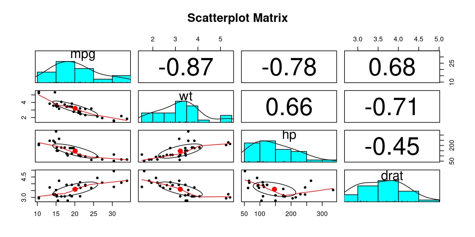
pairs.panels(tb[, c("mpg", "wt", "hp", "drat")], 
             main = "Scatterplot Matrix")

Discussion:

  • The psych package contains a variety of functions useful for psychological, psychometric, and personality research. [4]

  • We utilize the pairs.panels() function from the psych package to create a scatterplot matrix. This function is very helpful as it produces:

    • Histograms: The diagonal often contains histograms or density plots of the individual variables. This provides insights about the distribution of each variable.

    • Scatterplots: The lower triangle (below the diagonal) of the plot matrix contains scatterplots of each variable against the other. This helps to visualize the bivariate relationships between variables.

    • Correlation Coefficients: The upper triangle (above the diagonal) often contains correlation coefficients or other statistics that describe the relationship between the two variables. The size (and sometimes color) of these numbers typically changes based on the strength of the correlation.

    • Red Dot: In the scatterplots of the lower triangle, the red dot signifies the bivariate mean of the two variables being plotted. In other words, it represents the average value on the x-axis and the average value on the y-axis. The red dot helps you to quickly gauge where the center of the data is in relation to the scatter of the rest of the points. If the red dot (bivariate mean) is centrally located, it may suggest that the variables are symmetrically distributed around their means. If it’s located towards one of the corners, it could suggest a skew in the data or a strong correlation between the variables.

    • tb[,c("mpg","wt","hp","drat")] in the code specifies the subset of the tb data frame that we want to include in the scatterplot matrix. In this case, it refers to the columns mpg (miles per gallon), wt (weight), hp (horsepower), and drat (rear axle ratio).

    • The main parameter sets the main title for the plot, which in this instance is “Scatterplot Matrix”. [5]

Scatterplot Matrix Using ggpairs() in package GGally

# Load the 'GGally' package, which contains the 'ggpairs()' function
library(GGally)

# Create a scatterplot matrix using the 'ggpairs()' function
# Select the columns "mpg", "wt", "hp", and "drat"
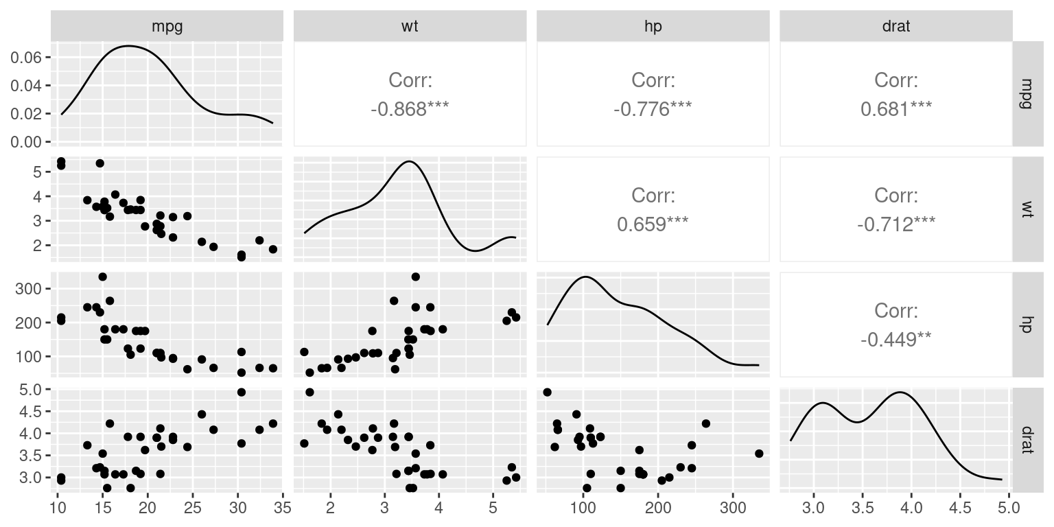
ggpairs(tb[, c("mpg", "wt", "hp", "drat")])

Discussion:

  • The GGally package is an extension of the renowned ggplot2 package in R. It offers enhanced functionalities to create specific types of plots, especially when dealing with relationships between multiple variables.

  • The ggpairs() function is a standout tool from GGally. It is designed to generate scatterplot matrices (often known as pairs plots) in a visually appealing format, providing insights into the pairwise relationships between variables.

  • In the given code, the data frame being operated on is denoted by tb.

  • The selection tb[,c("mpg","wt","hp","drat")] specifically picks out the columns named “mpg”, “wt”, “hp”, and “drat”. This means that our scatterplot matrix will show the relationships among these four variables. As a reminder, assuming typical automotive datasets: “mpg” might signify miles per gallon, “wt” would be the weight of the vehicle, “hp” indicates horsepower, and “drat” could represent the drive axle ratio.

  • The output plot, produced by ggpairs(), will display a 4x4 grid. The diagonal of this grid usually portrays histograms or density plots for the individual variables, while the off-diagonal segments demonstrate scatter plots between two variables, giving a comprehensive overview of how each variable relates to the others. [6]

Summary of Chapter 14 – Bivariate Continuous data (Part 3 of 4)

In this chapter, we explore the analysis of relationships between continuous variables. We begin by preparing a sample dataset and converting it to a structured format. As we move forward, we emphasize the importance of visual tools like scatter plots for understanding correlations and patterns between variables. These visual tools can reveal underlying trends, groupings, anomalies, and influential data points.

Using practical examples, we demonstrate how to create and customize these visualizations for clearer insights. Additionally, we introduce methods for enhancing scatter plots, including adding trend lines. The chapter also touches on the visualization of interactions between multiple variables, including the integration of categorical data, by means of color differentiation.

Transitioning from scatter plots, we explore the concept of a scatter plot matrix, or SPLOM. This tool is instrumental in showcasing pairwise relationships between a set of variables in a matrix format. Scatter plot matrices are incredibly helpful when navigating multivariate datasets, allowing quick visual recognition of potential correlations and relationships among variable pairs.

We then demonstrate how to create scatter plot matrices using R functions like pairs(), scatterplotMatrix(), and pairs.panels(). Each method offers a different visual experience and comes with its unique set of features. For example, using pairs.panels() from the psych package, the matrix not only contains scatter plots but also histograms on the diagonal, correlation coefficients, and other enlightening statistical visualizations.

Overall, this chapter equips us with the knowledge to visualize and analyze bivariate continuous data effectively, aiding in more profound data interpretation and insights.

References

Basic R Programming:

[1] Chambers, J. M. (2008). Software for Data Analysis: Programming with R (Vol. 2, No. 1). Springer, New York.

Crawley, M. J. (2012). The R Book. John Wiley & Sons.

Gardener, M. (2012). Beginning R: The Statistical Programming Language. John Wiley & Sons.

Grolemund, G. (2014). Hands-On Programming with R: Write Your Own Functions and Simulations. O’Reilly Media, Inc.

Kabacoff, R. (2022). R in Action: Data Analysis and Graphics with R and Tidyverse. Simon and Schuster.

Peng, R. D. (2016). R Programming for Data Science (pp. 86-181). Leanpub, Victoria, BC, Canada.

R Core Team. (2020). R: A Language and Environment for Statistical Computing. R Foundation for Statistical Computing, Vienna, Austria. Retrieved from https://www.R-project.org/.

Tippmann, S. (2015). Programming Tools: Adventures with R. Nature, 517(7532), 109-110.

Wickham, H., Çetinkaya-Rundel, M., & Grolemund, G. (2023). R for Data Science. O’Reilly Media, Inc.

Statistics Using R:

[2] Braun, W. J., & Murdoch, D. J. (2021). A First Course in Statistical Programming with R. Cambridge University Press.

Cohen, Y., & Cohen, J. Y. (2008). Statistics and Data with R: An Applied Approach Through Examples. John Wiley & Sons.

Dalgaard, P. (2008). Introductory Statistics with R. Springer.

Davies, T. M. (2016). The Book of R: A First Course in Programming and Statistics. No Starch Press.

Everitt, B. S., & Hothorn, T. (2014). A Handbook of Statistical Analyses Using R. Chapman and Hall/CRC.

Field, A., Miles, J., & Field, Z. (2012). Discovering Statistics Using R. Sage Publications.

Fox, J., & Weisberg, S. (2018). An R Companion to Applied Regression. Sage Publications.

Hyndman, R. J., & Fan, Y. (1996). Sample Quantiles in Statistical Packages. The American Statistician, 50(4), 361-365.

Matloff, N. (2011). The Art of R Programming: A Tour of Statistical Software Design. No Starch Press.

R Core Team. (2020). R: A Language and Environment for Statistical Computing. R Foundation for Statistical Computing, Vienna, Austria. Retrieved from https://www.R-project.org/.

Schumacker, R. E. (2014). Learning Statistics Using R. Sage Publications.

Schumacker, R., & Tomek, S. (2013). Understanding Statistics Using R. Springer Science & Business Media.

Regression:

[3] Fox, J., & Weisberg, S. (2011). An R Companion to Applied Regression (2nd ed.). Sage, Thousand Oaks, CA.

car:

[4] Fox, J., Weisberg, S., Adler, D., Bates, D., Baud-Bovy, G., Ellison, S., Heiberger, R., et al. (2012). Package ‘car’. R Foundation for Statistical Computing, Vienna.

psych:

[5] Revelle, W. (2020). psych: Procedures for Psychological, Psychometric, and Personality Research. Northwestern University, Evanston, Illinois. R Package Version 2.0.12. Retrieved from https://CRAN.R-project.org/package=psych.

GGally:

[6] Schloerke, B., Crowley, J., & Cook, D. (2018). Package ‘GGally’: Extension to ‘ggplot2’.